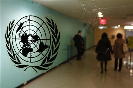
Ouch.
The symbol is lifted out with the magic wand tool in pieces creating a stack of layers that is merged into one layer and repaired as a separate transparent layer. Its circular form restored and the olive branches equalized.
It would easer to take another U.N. symbol transparent GIF file right off the internet, first results right off, and apply it like the original Photoshoppers did, to start with a good copy rather than start with a previously distorted copy. But I did not do that. I worked with the bolloxed copy and that is the part that took the longest, and it was not necessary.
It would easer to take another U.N. symbol transparent GIF file right off the internet, first results right off, and apply it like the original Photoshoppers did, to start with a good copy rather than start with a previously distorted copy. But I did not do that. I worked with the bolloxed copy and that is the part that took the longest, and it was not necessary.
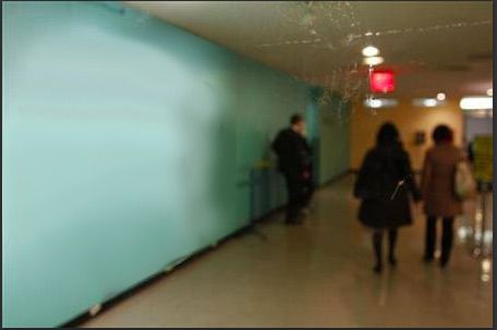
Wall repaired with blur tool. No time spent trying to create a gradient. Very rough smudging using the smudge tool. Too much light activity on the wall and too poor a quality photograph to bother with cloning patches and such. JPG vestiges on ceiling blurred similarly. No care taken at all because the original is so poor.
There are two layers showing here, the background, and the symbol, but only the symbol is active The background layer is activated but not active and showing to assist with the perspective. If the wall were to continue it would diminish to a point, and the perspective function will help match the shape of box containing the U.N. symbol to the shape of the wall. Only one layer is worked on at a time and right now it is the symbol. The top and bottom of the blue wall are more important than the assisting overlapping grid.
Keystrokes created that overlapping grid to help in selecting the UN symbol precisely.
It can also be selected by casting a marquee selection with keystrokes around the whole frame and then using the move tool to nudge the symbol out of place by pixel or two, at that moment the marquee selection around the frame collapses around the U.N. symbol like a skin to be moved around the transparent layer as and object. Selected like this, the object can have many functions applied to it separately.
When the perspective edit -- transformation menu function is picked then the marquee selection changes to a box encompassing the symbol but nothing else. Narrowing the selection down like this presents precise corners to tug into perspective.
It is best to resize the image first before choosing the perspective menu function, rather than using perspective function to resize. That way the corners can be tugged straight up and down. Otherwise Photoshop will attempt a whole new perspective based upon your relocated point and recalculate new points all around for its new plane of perspective. It goes all wonky trying to comply and insists on positions you don't want in order to perform calculations for the remaining points. So best to do resizing outside of perspective, then return to it as necessary.
You can also select the entire frame with keystrokes and apply perspective to the whole frame, still using the blue wall for reference.
One corner on the right tugged to shrink that side, and the bottom line and the top line of the selected area conforms to the shape of the wall, then one corner on the left to enlarge that side, the point dragged straight up so that the top and bottom lines of the selected area conforms with the shape of the wall. It's so easy when there is a wall to guide. It is impossible to error. (The Drudge photo did the impossible)
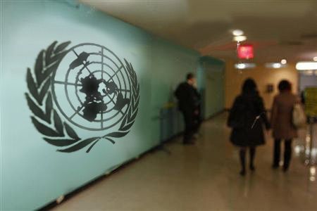
See how it shrinks the distant side and enlarges the near side? This is a slap dash job and look how much better it is already.
Symbol blurred with blur filter from the menu (not the tool this time) to be as messed up as the rest of the picture. Several types of blur are available. Try them and see which one you like, try different intensities, and back up if you don't care for the result. As it turns out, this was the first blur filter I tried. It worked for me. If I continued then probably another better blur would show, but I don't care because I'm not trying to fool anybody like the original hoaxers were.
The two visible layers are merged and saved as JPG.


1 comment:
The original is NO Photoshop. It's a photo, most likely untouched, of glass doors at UN headquarters, which have the logo applied with a adhesive transparency,
How come that's not obvious to someone who wrote so many lines on the "bad-photoshop," is beyond me.
Post a Comment